
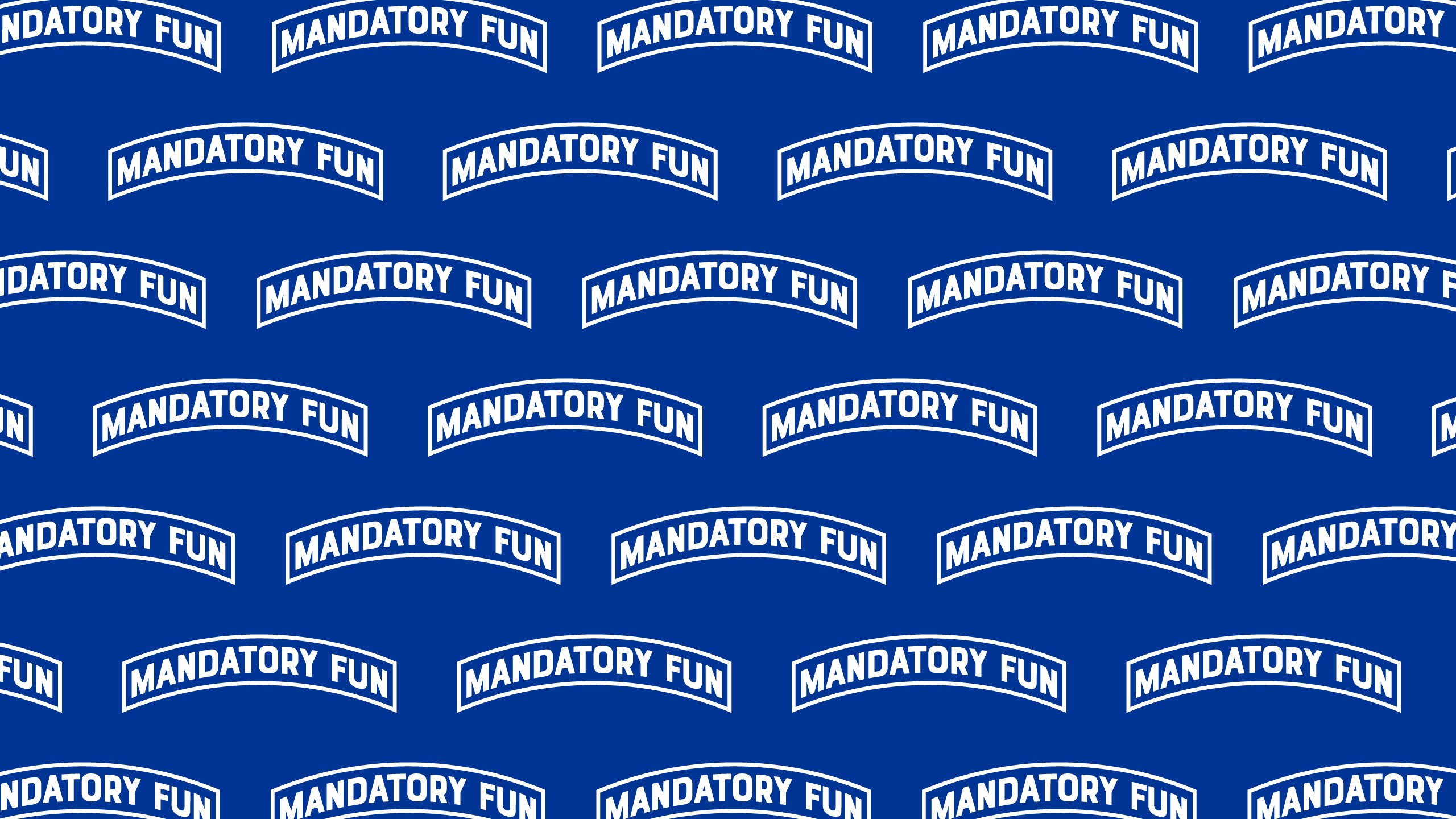
Designing a logo is all fun and games until you have to do it. That’s where the rubber truly meets the road… I went through a number of initial variations of the Mandatory Fun logo design before landing on one and then learned that I wanted to iterate from there.
Here is the story in case it can be helpful to you.
The Mandatory Fun Tab
It seems like it should be obvious, but I can tell you that it wasn’t at first. Originally, I was fixated on this site being sort of a virtual club and I made a number of designs with a play in that direction that I am too embarrassed to show anyone.
I did know one thing when I started, though, and that was that I did NOT want to create another badass veteran owned military brand because sweet Jesus, they are a dime a dozen out here – each one 69% more badass than then next.
I was in the Air Force, bro. I can read.
Plus, I was an Acquisitions Officer. I typed emails, a lot. Sure, I deployed to Iraq but it was right AFTER we won and guess what I did there… if you guessed that I typed emails and proofread decorations, you are correct. That’s what I did and I’m cool with it. They’re not making movies about all of us email assassins out there and they shouldn’t – watching someone get a bunch of no-notice taskers completed by EOD doesn’t exactly scream “Summer Blockbuster.”
So, you get it.
As much as I tried to find a brand keeping it real for the email warrior and/or email warrior adjacent part of the military, I couldn’t. There wasn’t one, so I kept iterating on the design and I always kept this idea of the brand’s north star close to my heart.
Then one day, I landed on the tab design after remembering our class year patches on the old A-Jacket.
2000 was the first class with a class exemplar and I loved that our class’ exemplar was General Jimmy Doolittle because:
- The Doolittle Raiders story is super cool
- Our class year patch on our arms read Doolittle 00
Classic.
Something about that little banner that had General Doolittle’s name on it led to me think about tabs. I get that tabs are way more Army than Air Force, but the idea of earning a tab related to being subjected to Mandatory Fun felt “on brand” for the thing I wanted to create. I took inspiration from the Army’s Airborne tab because it’s blue and because I successfully completed Airmanship 490 at the Zoo and got my jump wings.
Once I had an idea that felt right, execution was super basic in Adobe Illustrator messing around with the Arc tool.
Alternate Logo for Social Media
The tab logo is great for a website, but over time I became unhappy with how it looked as a social media icon. The tab gets really hard to read or even recognize when it has to fit into a little circle on your mobile phone.
So I decided to do something about that.
If you’re a fan of the NBA, you know that your favorite team has an alternate logo and I always thought that was cool because my favorite team’s alternate logo was on point. That was enough for me to take some inspiration for Mandatory Fun having an alternate logo that I could use as a social media avatar, as well.
At this point, very few people know about Mandatory Fun and it is likely that nobody cared. But these are the types of things I end up thinking about and ultimately obsessing over, so what are you going to do?
For whatever reason, I personally think of lighting bolts when I think of the Air Force Academy. Probably because Air Power, but your guess is as good as mine. And I knew that if I wanted to use a lightning bolt in any design that I would need to come up with something of my own. Probably because trademark law, but your guess is as good as mine.
After spending some time on the Internets a couple things became clear to me:
- I wanted a circular design because most social channels have circles for avatars
- I like bolts with pointed edges on both sides
Once I knew that, I was able to look for existing designs that incorporated that type of lightning bolt and I drew a lot of inspiration from both the DC Comics character “The Flash” and the Tampa Bay Lightning logos. I really liked how simple the Flash logo was with an inner and outer circles. I also really liked how the Tampa Bay Lightning’s logo created sort of a drop shadow as it extended over its outer circle.
You could say that I completely ripped off the Flash logo, and there may be some truth to that… it is clearly derivative when you look at them both together.
But I am happy with how it turned out with the twist that added to it, and it solved the problem that I set out to solve.
From a business / branding standpoint, I do like the idea of turning these designs into promo stickers that you can only earn buy purchasing stickers from the site – and remain open to that idea some day.
